

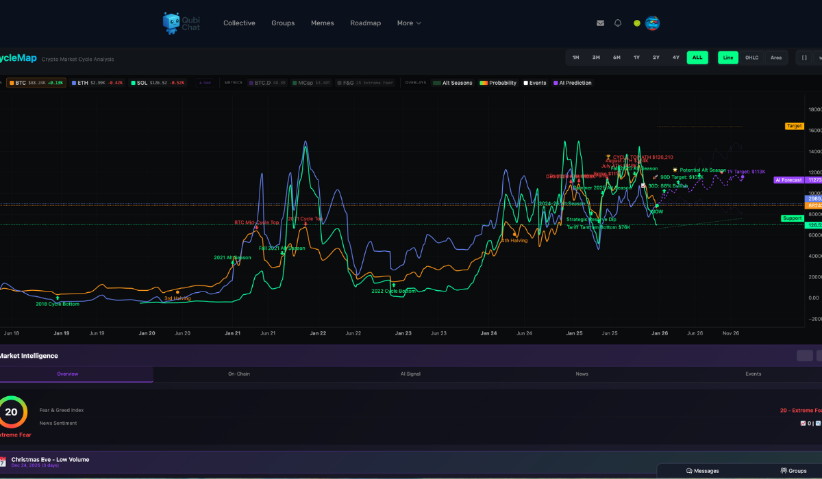
If you have been in crypto for more than one market cycle, you have probably noticed something strange. Prices move in waves. Not just random pumps and crashes, but repeating phases that feel familiar every few years. This is where a crypto cycle chart becomes one of the most useful tools (Cycle Map) a trader or long term holder can use.
A crypto cycle chart helps visualize how Bitcoin and the broader market move through accumulation, expansion, euphoria, and decline. While no chart can predict the future perfectly, understanding these cycles gives you a serious edge over reacting emotionally to price movements.
What Is a Crypto Market Cycle
A crypto market cycle refers to the repeating pattern of price behavior that happens over time. While each cycle looks different, they often follow the same structure.
The cycle usually starts with a long period of accumulation. This is when prices are quiet, sentiment is low, and interest from the public is minimal. Next comes expansion, where prices begin to rise steadily and confidence slowly returns. After that is the euphoric phase, where prices accelerate rapidly, media attention explodes, and new participants flood in. Finally, the cycle enters decline, where prices fall, hype disappears, and weak hands exit the market.
A crypto cycle chart helps you see where these phases occurred in the past so you can better understand where we might be now.
Why Bitcoin Cycles Matter More Than Any Other Chart
Bitcoin drives the entire crypto market. When Bitcoin moves, everything else reacts. This is why most crypto cycle charts focus heavily on Bitcoin rather than individual altcoins.
Historically, Bitcoin cycles have been influenced by events like halving cycles, liquidity conditions, and broader macroeconomic trends. While many people talk about the four year cycle, the reality is more nuanced. Cycles stretch and compress depending on market conditions, adoption, and capital flows.
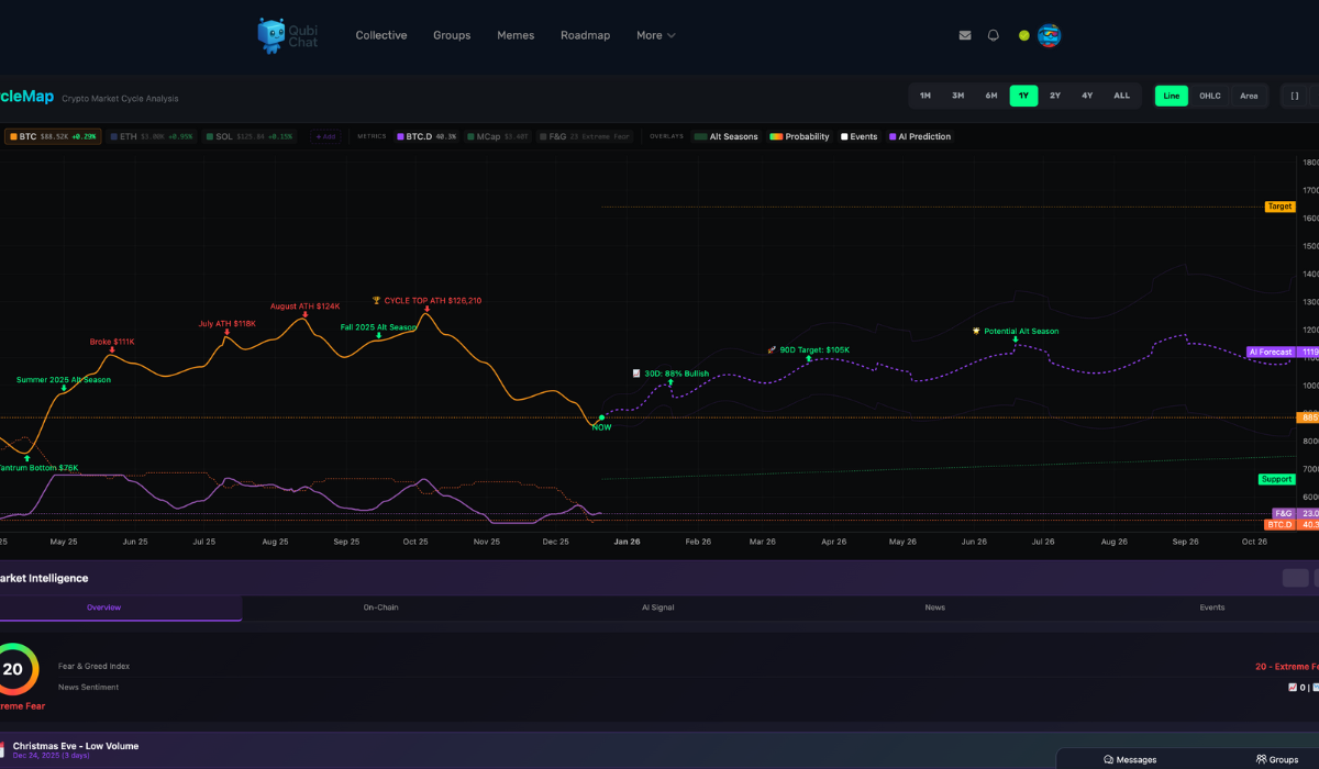
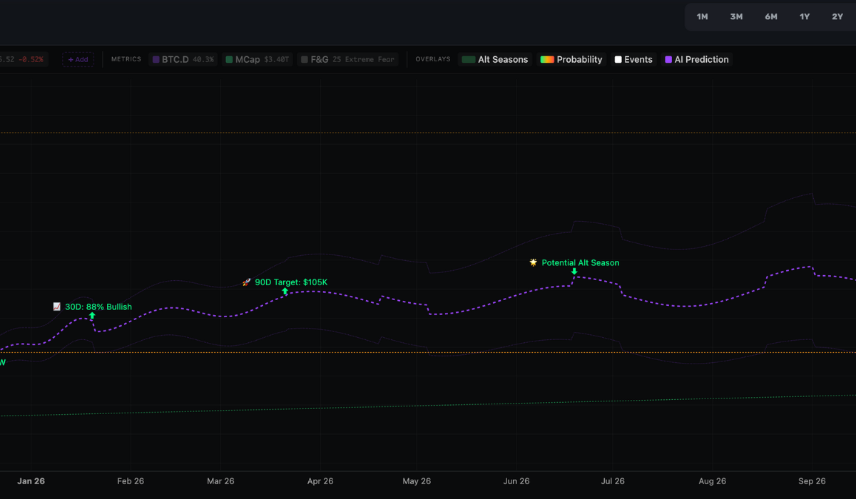
A good Bitcoin cycle chart does not just show price. It shows time, momentum, and historical context all in one place.
What a Good Crypto Cycle Chart Should Show
Not all cycle charts are useful. Some are static images that never update. Others oversimplify complex market behavior.
A strong crypto cycle chart should include historical price data across multiple cycles, clear markers for major cycle transitions, and the ability to compare current market conditions to past cycles. Even better is a chart that updates live and allows you to zoom in and out to see both macro and micro trends.
This is exactly why live tools outperform simple images. They allow you to study how cycles evolve rather than assuming history repeats perfectly.
Are Crypto Cycles Predictable
This is the question everyone asks. The honest answer is no one can predict the market with certainty. However, patterns do exist, and ignoring them puts you at a disadvantage.
Crypto cycle charts are not meant to give exact top or bottom dates. They are meant to provide context. When prices are far above historical norms, risk is higher. When prices are deeply below long term averages and sentiment is negative, opportunity tends to increase.
Understanding cycles helps you avoid buying into hype and selling into fear.
Using a Crypto Cycle Chart the Right Way
The biggest mistake people make is using cycle charts as trading signals instead of decision support tools. A cycle chart should be combined with risk management, patience, and an understanding of market psychology.
Instead of asking whether the market will pump tomorrow, the better question is where we are within the broader cycle. That perspective alone can change how you approach investing.
If you want to explore this visually, you can use our live Crypto Cycle Chart tool to see historical Bitcoin cycles, market phases, and real time data all in one place. The goal is clarity, not prediction.
Final Thoughts
Crypto rewards those who stay rational while others panic. A crypto cycle chart does not eliminate risk, but it helps you make better informed decisions instead of reacting emotionally.
Markets move in cycles because human behavior moves in cycles. Understanding that simple truth is often the difference between surviving a bear market and being shaken out at the worst possible time.
Useful tools: Cycle Map